A Shared Language for the Interface
Gold frames, quieter windows and a colourful Toon icon library bring the interface closer to the world, through repeated comparisons and small corrections.
21 October 2026 · The Epos of Ashes Team · 4 min read
Cover: Icon presentation · October 2026
An interface has to belong to the world around it. It also has to tell you, quickly, which object you are carrying, what an action needs and where to look next. Those goals have shaped the latest HUD, window and icon work in Epos of Ashes.
The direction is colourful and rounded: playful objects inside a fantasy interface, with gold ornament and calm navy surfaces. The work has progressed through mockups, real development captures and repeated feedback on individual elements. It is a continuing redesign, rather than a claim that every menu is now finished.
Finding the right frame
We began by comparing the Synty Fantasy Warrior HUD package against our own scenes. Following that evaluation, the package was purchased and imported. Its frames and ornaments provide the foundation; the complementary object and action icons were created with ImageGen using the accepted references, exported for their UI roles and individually reviewed. These are distinct sources, not a claim that all the interface art was hand-drawn in-house.
The useful changes often came from small discrepancies: a background escaping its frame, a symbol sitting off-centre, text too close to an edge, or a button carrying more ornament than its role needed. Correcting those details takes several passes, because an attractive isolated panel can still feel wrong beside the HUD.
Give the world the centre
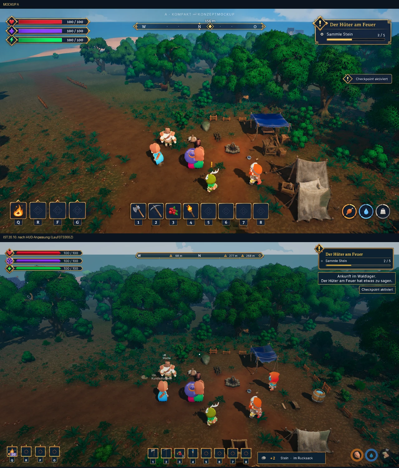
Health, magic and stamina keep distinct red, violet and green identities, with their own symbols and saturated fills. The compass is a slim band, with targets contained within it. Quest panels carry more character, while checkpoint notices and item-gain messages remain smaller and quieter.
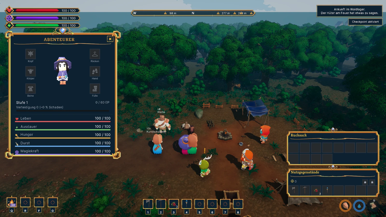
Action slots can carry gold frames and separate key tabs. Storage slots should recede: dark tiles for a backpack, equipment, a chest or crafting inputs. Treating every square as a decorated button would make the things you need to read compete with the things you need to use.
The same distinction guides the windows. Main panels have stronger ornament; supporting surfaces are lighter. Titles and buttons use Texturina, with simpler body text and technical hints. Spacing belongs to each panel's content, and storage layouts follow the agreed four-slot row model. Real character portraits come from the portrait camera rather than generic person symbols.
A library, rather than a collection of exceptions
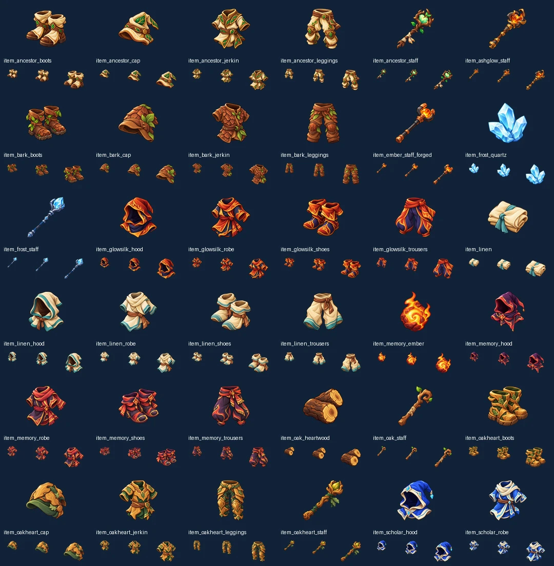
The reviewed delivery contains 312 transparent PNGs serving 330 semantic icon IDs. Shared motifs and aliases explain the difference. The exports are 128 or 256 pixels square, sized for interface use; the larger generation sources stay separate.
For the checked content snapshot, mappings cover 176 items and 30 player abilities, as well as 133 recipes, 123 skill nodes and 12 knowledge entries. Those latter counts are content mappings, not hundreds of additional unique pictures. New content will still need its own coverage check.
The latest 49-image addition covers 32 armour pieces, six staffs, five materials and six mastery books. Eight equipment families use their own material and colour cues: linen, scholar, glow-silk, memory, bark, suede, oak-heart and ancestor. Cloth, fur, wood and metal should remain recognisable at a small size. Staff crowns and wordless book emblems help distinguish related objects without putting text into the icon itself.
The symbols are separate transparent objects. Frames, selection, rarity indicators, cooldown masks and effects belong to other layers. That gives hover, press and pulse feedback a consistent foundation without regenerating the object artwork. It does not mean every possible animation is implemented, or that an illustrated spell introduces a new effect by itself.
What the checks establish
The art audit covers all 312 images at several small display sizes, alongside alpha, dimensions, identity and content mappings. A separate integration handoff confirms the 312-image import and 330-ID library, with all 176 items assigned and the corresponding item/content checks passing. Earlier ability integration has its own focused tests.
That is stronger evidence than a contact sheet alone, but it remains distinct from current window-by-window player review. The older screenshots here do not verify the final 49-image series inside today's backpack, trading and crafting screens. Complete native input, language, resolution and readability acceptance, and a new standalone release, are not established by these art and import checks.
The point of the work is a more coherent journey through the interface: recognising an object in the world of the game, finding it in a bag, and meeting the same visual language again in crafting or a skill description. The inventory guide, crafting notes and skill guide carry the current scope alongside this development record.