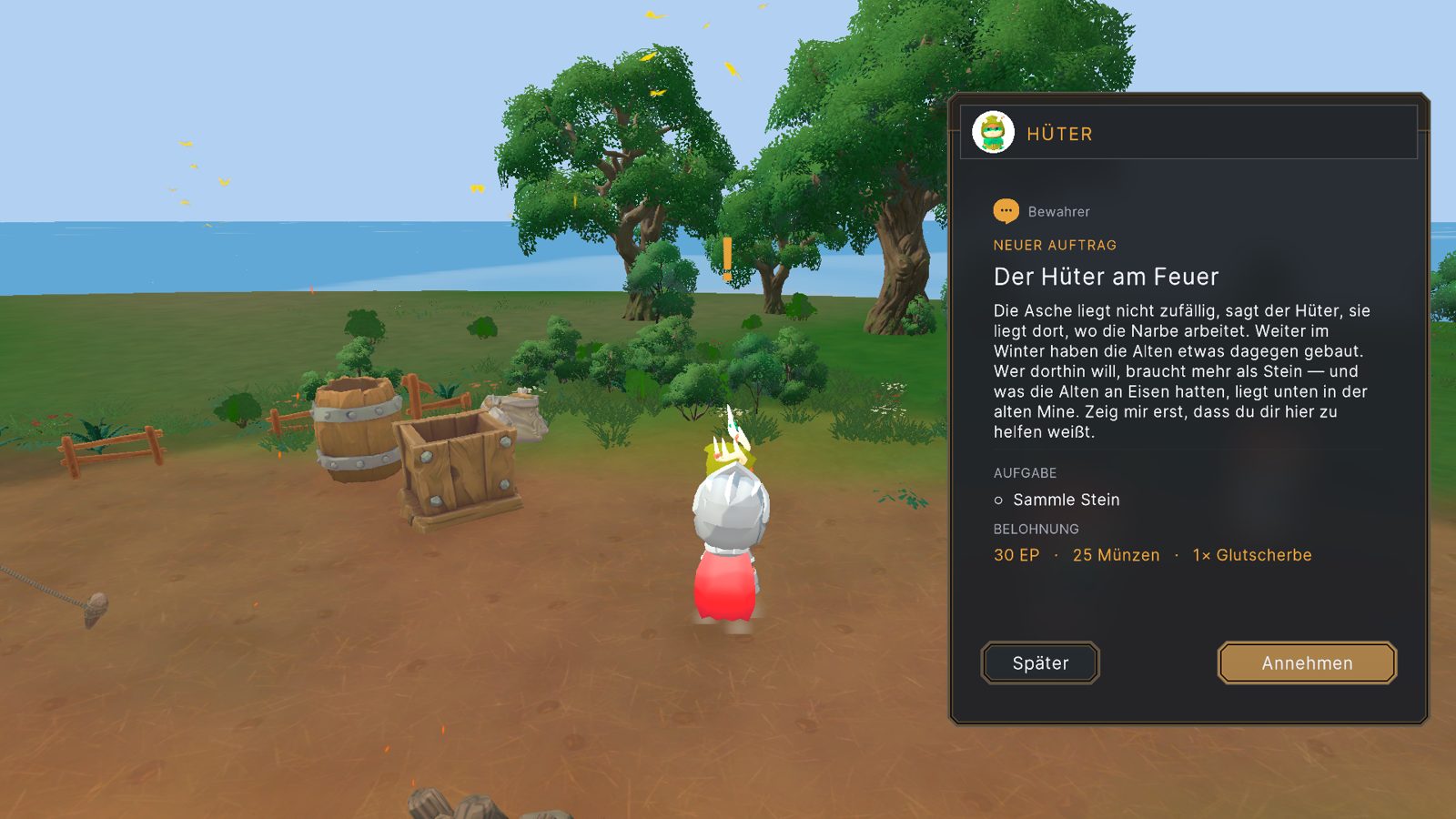
A Frame Worth Looking At
Metal frames, square headers, gold capitals and bronze buttons — the interface got rebuilt from the ground up.
21 August 2026 · The Epos of Ashes Team · 1 min read
Cover: In-game · WIP
Our interface had been functional for a long time. Functional is not the same as good. This month we rebuilt it — twice.
The first rebuild
We started from reference: survival games and RPGs whose menus we like to spend time in. Item grids, a compass band, an eight-slot quickbar, windows that look like they belong to the world instead of floating over it. We tried a frosted-glass look and a set of full-screen menus — and then decided it still wasn't ours.
The second rebuild
The style that won came from our character selection screen: a metal frame, a square header, gold capitals and bronze buttons on a warm, dark umber. That's now the standard for every window in the game. The colours on this website come from the same palette.
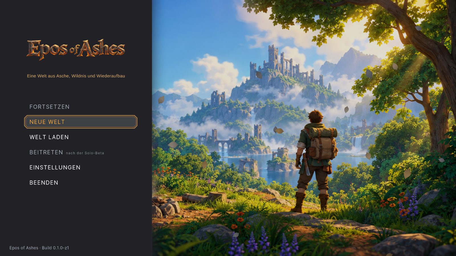
What changed
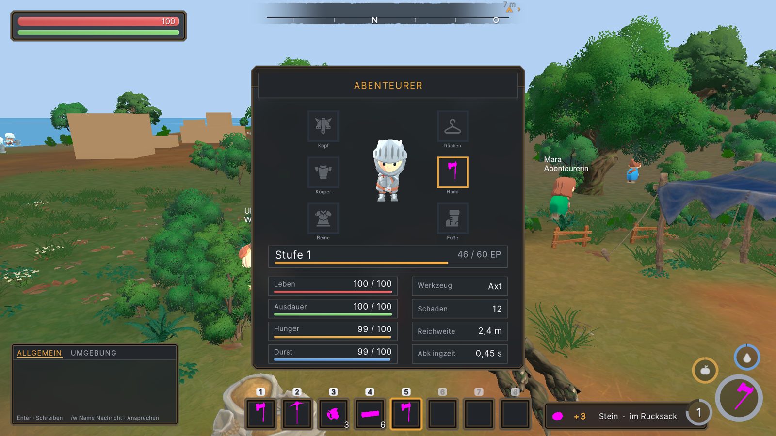
- Character and equipment show your hero framed by their real silhouette, with slots for head, body, legs, feet and back.
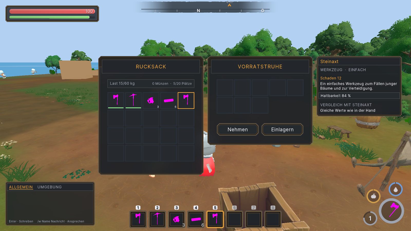
- Containers open side by side with your backpack.
- Tooltips show stats, rarity and durability at a glance.
- Windows can be dragged where you want them.
- The quest card sits in the top right; the journal holds everything else.
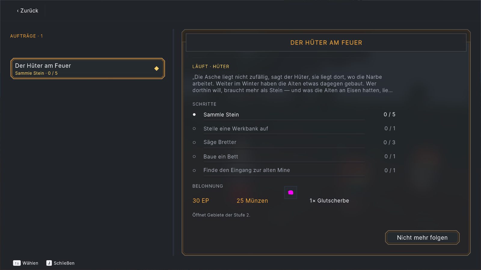
Compare that to our first start menu from back in spring and you'll see how far it has come. Some icons are still placeholders — they're next.